The first release of the "Yin Yan Song Qi" font, a mysterious font that has been shrouded in dust for half a century | Exhibition Board | Font
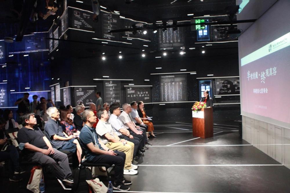
On the 17th, the Shanghai Institute of Printing Technology held a press conference on "Intangible Cultural Heritage Handmade Font Song Qi" at the China Museum of Modern Press and Publication. The half century old "Printing Research Song Qi" font was officially released.
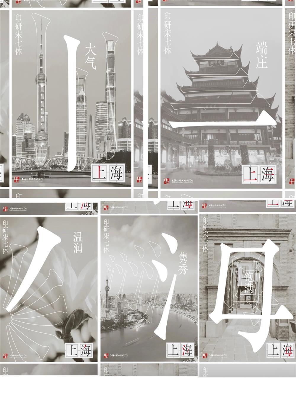
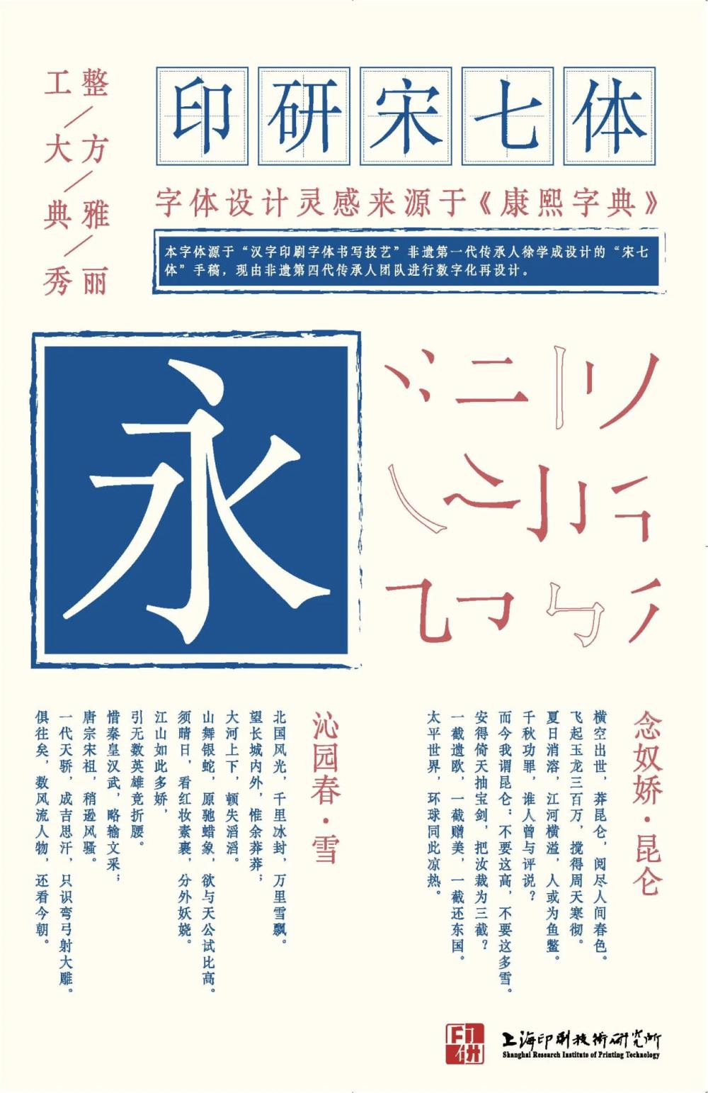
The design inspiration for the "Song Seven Style" comes from the prefix of the Kangxi Dictionary, so it is also known as the Kangxi Dictionary Style, which is highly ancient and elegant. Unlike traditional Song typeface characters that are straight and upright in both horizontal and vertical directions, the "Song Seven Body" has a slender shape, a round and thick pen shape, and a strong woodblock style. The brushstrokes show a low left and high right posture, with a gentle and smooth vertical hook, and a clear sense of hanging at the end of the dots. It not only has the calligraphy charm of regular script writing, but also highlights the brushwork characteristics of Song typeface. Its design combines aesthetics and practicality, and is not only suitable for arranging the main text of various books, newspapers, and magazines, but also meets the needs of the times. It is a font that can be used for digital media screen display.
In the early days of the founding of the People's Republic of China, the printing of lead type continued to use old font styles, with messy fonts and shapes, and mixed use of variants and variants, seriously affecting the quality of printing and reading effects. In 1959, the Ministry of Culture held a meeting to guide Shanghai to take the lead in carrying out the "printing font reform". Based on the Shanghai Printing Technology Research Institute, it gathered three talents with artistic creativity, proficiency in writing regular script, and experience in carving font models in Shanghai, and established a font research laboratory consisting of more than 50 people.
The designers from the Font Research Office of Shanghai Printing Technology Research Institute spent 5 years developing a complete set of handmade skills, and successively completed the creation and design of four commonly used printing fonts: "Song, Black, Kai, and Imitation", totaling 80000 characters. These fonts have been used to this day, not only making great contributions to the promotion of simplified characters and the standardization of Chinese character use in New China, but also playing a key role in the popularization, inheritance, and development of Chinese character culture. The "Chinese Character Printing and Writing Skills" project, applied for by the Shanghai Institute of Printing Technology in 2009, was included in the second batch of Shanghai Intangible Cultural Heritage Project List.
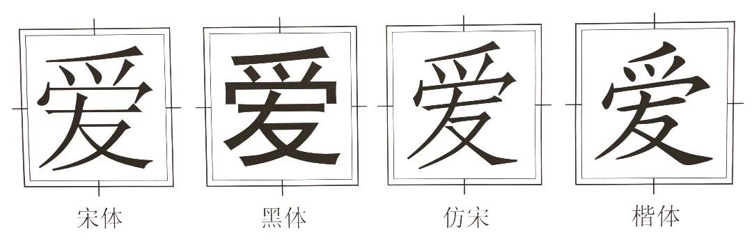
Among the four classic printing fonts of "Song, Hei, Kai, and Fang", Song typeface is the most commonly used publishing printing font. The Shanghai Institute of Printing Technology has launched multiple sets of Song typefaces with different styles through manual design in the 20th century. These fonts are all named after numbers, and each one carries a significant historical mission.
Among them, "Song Yiyi" is a type of character specifically designed for the main text of the first "Cihai" in New China in 1962, with a square shape and a delicate pen shape; Rigorous structure, neat lines, and smooth reading. Afterwards, it was used in the main text of large reference books such as the 1985 edition of the Chinese Dictionary.
"Song Erti" was designed in 1963 as the main text of the first edition of the simplified horizontal style "Selected Works of Mao Zedong", and later known as the "Classic Works Style". Its shape inherits the tradition of horizontal light and vertical heavy, with sharp edges and corners. The shape is straight and elegant, atmospheric and clear, smooth and natural. The Song typeface is widely used for typesetting various books and periodicals, and is the most widely used Chinese character font in the world today. The commonly used Song typeface in computer font libraries nowadays is mostly processed and produced based on this font.
The Song Sanshi was designed in 1964 to print Mao Zedong's Poetry, hence it is also known as the Mao Zedong Poetry Style.
The "Song Five Style" and "Song Six Style" were designed in 1970 and 1980, respectively, and are widely used in outdoor slogans and titles for books, newspapers, and magazines.
Among these Song typeface families, there is a special font originally named "Song Si Ti", later renamed "Song Qi Ti", designed by Xu Xuecheng, the first generation inheritor of the intangible cultural heritage of "Chinese character printing font writing skills", in 1968. Due to historical reasons, this font design was not released after completion, and the manuscript was sealed and forgotten in the font warehouse of the Institute of Printing and Research.
In 2020, with the recommendation and guidance of Chen Qirui, the second generation inheritor of the intangible cultural heritage project "Chinese Character Printing and Writing Skills", this set of typefaces was found and re published. The Shanghai Printing Technology Research Institute has launched the "Song Seven Body Development" project, led by the fourth generation inheritor of intangible cultural heritage, to summarize, refine, and redesign based on hand drawn original manuscripts. At present, the first phase of development for "Song Qiti" has been completed, with the first release of 6763 Chinese character library products. In the future, products that support large character sets will be launched.
The Shanghai Printing Technology Research Institute was established in 1956 and is the birthplace of modern Chinese character printing fonts. It is the original creator of Chinese character printing fonts such as Song, Hei, Kai, and Fang, and also the inheritor and protection unit of Shanghai's intangible cultural heritage project "Chinese character printing font writing skills". In the first part of the Art and Design Museum on the fourth floor of the Museum of Modern and Contemporary Press and Publication in China, the "Character Reform and 'Old Innovation'" unit of "Chinese Characters and Publishing" displays the "Song typeface and black typeface printing movable type design drafts" provided by the Printing and Research Institute. Authorized fonts from the Institute of Printing and Research have been used in many areas of the museum, including signage, display board text, and sculpture design. The square sculpture "Xinglu" uses "Song Heiti"; The name of the guide hall is in "Song style"; The second level title, content text, third level title, and address of the theme hall became the first user before the release of "Song Qiti". The classic print font design that has witnessed the development of China's news and publishing industry is showcasing its unique charm in this brand new news and publishing professional museum.